Thursday, October 14, 2010

NOTES TO NONSELF


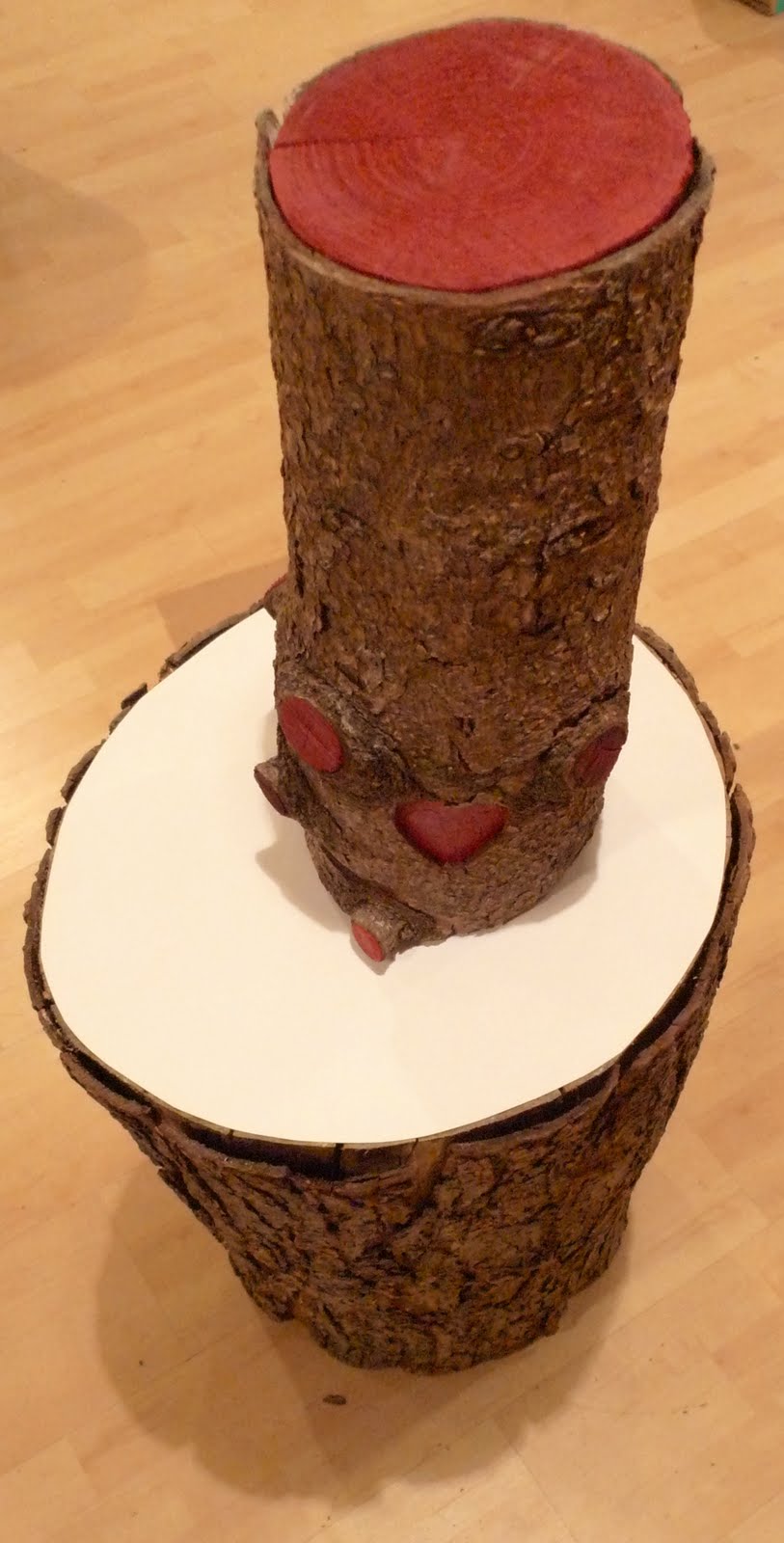
Notes To Nonself, currently on view at Herron Galleries in Indianapolis, is an incredible journey through the passageways of self-hood by artists Diane Christiansen and Soshanna Utchenik, both originally from Chicago. They aptly describe the exhibition, which was first installed at Chicago's Hyde Park Art Center, as a "metaphoric landscape for the activity of the mind." The exhibition's immersive environment is composed of an ego forest rife with clouds, an octopus of attachment, a campsite that cannot be entered, a meditation center/clubhouse that visitors may utilize, a video installation, and strings of prayer flags to which viewers are invited to add their own flags containing positive intentions. "The areas are things you get hooked on, things your mind gets hooked on and obsesses on," Christiansen explains. The octopus, for example, represents attachment: relational, body image, and attachment to youth. Each tree in the ego forest represents a false duality such as isolation/connection and sloth/activity.

The cohesion between the two artists is almost startling to witness in real time; they regularly complete each other's thoughts and interact with the outside world very much as one unit. The pair met when Utchenik was introduced to Christiansen on the pretext that she might be able to help her create a giant cartoon character of Christiansen's design out of paper machete. When Utchenik moved to Slovenia, she reached out to Christiansen and the two began a friendship that developed through physically mailing small notes and pieces of ephemera to each other as well as contact through Skype and other online means. These same notes blossomed into Notes To Nonself, and most of them are integrated as collages into the trees of the ego forest. "Some of our worldviews are very shockingly similar and hilariously so, and so we started seeing the world and each other and ourselves in these notes, sort of colliding, and we hadn't really known each other before." Christiansen muses. "Once we saw this accumulation and the potential for continuing that process of communicating visually through materials, we were like 'OK, let's propose putting this together in a space,'" Utchenik adds.


The artists describe the coming together of Notes To Nonself as "slapdash." "When she says slapdash, that really alludes to a whole world of people coming together to gather all these elements, and not necessarily quick, but just rough...the notes are very precise in terms of personal moments captured...the actual construction was very rough, and really reliant on faith, on just believing that this would come together with one person helping us with this thing, and one person helping us with another and faith also that we should make this, because it is a crazy scale considering that when we began the process we didn't have any support or financial support," the artists explain. The materials they used to construct the different parts of the exhibition are quite unique: bamboo, paper machete, tape, plywood and fishing wire. "Nonself" refers to a lack of solidity and the interconnectedness not only of beings but of everything. Notes To Nonself's iconology, including the video, feature "peculiar landscapes filled with trees, skulls and distinctive cartoon figures and animals," to quote the exhibition catalog; Christiansen's recent drawing and painting work are heavily influential here, and it is important to note that the skulls are a Tibetan reference and symbolize the death of the ego.


Notes To Nonself is a decidedly quirky exercise in exploring human truths, relationships, and ideas of self and ego. Navigating through the exhibition necessitates some level of interaction with all of its different parts; this is not a series of flat works on walls or 3D works on pedestals but a complete environment that must be grappled with. It is deeply personal, yet the artists have succeeded in making a personal statement that forces viewers to have their own reckonings about ego, self-hood and the human experience.

A still image from the video in the exhibition


Thursday, October 7, 2010

IT'S A THOUGHT

Put me in Coach!


Indianapolis' fairly new Wake Press & Gallery recently closed It's A Thought, a combination solo and collaborative drawing project executed entirely in Wake's space. The exhibition was born from five days of collaborative drawing by current or former Herron School of Art and Design artists Sydney Webb, Michael Nannery, Marx Shoemaker and Adam Wollenberg. The result is an exercise in exploring and pushing the boundaries of drawing, a medium often overlooked in the fine art world. In this case it is hard not to pay attention; how do four artists mold a collaborative work through such an intensive process and still leave their individual "mark?" Done entirely in grey scale, the lack of colors draws attention to the artists' working methods, usually abstract content, and varied line structure and shading. Materials used for the work in this show include spray paint, latex paint, graphite, charcoal and even plaster. Four unique artists have come together and managed to make a cohesive offering through their solo works and the epic collaboration piece that takes up nearly an entire wall. "Even our individual drawings have an aspect of collaboration to them because we've done all the work right here in the gallery and while we're working we're just going around talking to each other about each other's drawings," explains Michael Nannery. Below are individual artist statements, images of the artists at work, images of the finished artwork, and a video of the artists during the creation of the artwork.


Sydney Webb


As a primary part of my art making I look at repetitive motion and cyclical growth in nature as the relating factors in all of my contexts, urban, rural and spiritual life. Drawing becomes a part of this as meditative practice. When I begin to draw, it is instinctual, finding forms from my surroundings and representing them as I see them. With this in mind, shapes morph into other shapes and forms become only valuable in representing the state of flux.

Native forms from instinctive form

Michael Nannery

At what point does a drawing aided by a photo reference cease to be a coherent thought? Through imitation of a two-dimensional image, the artwork at hand wavers closely to the point of being a mere representation rather than an extraction of artistic insight. A photo reference has the potential to curb the artist’s vision instead of manifesting possibilities. This is not to say that photo references are useless; they have ability to aid the artist in decision-making and analysis. In a sense, the source imagery may serve as a guide and collaborator for the actualization of the drawing. Ideally, a photograph should inform the drawing, not vice versa.

Accumulated Filth

Marx Shoemaker

I am less interested in replication than I am in vast descriptions. Complete with all the inconsistencies that arise when filtering information, this drawing is an attempt to describe the way an object inhabits space. What appeals to me are images that use lights and darks as language to explain depth and forms. I used a great abundance of this language in order to create shifts and movement.

Preservatives

Adam Wollenberg

Your thoughts can sometimes be perfect and direct but other times can be just a haze. This piece is based in symbolism and metaphors, as a reflection of my perception on drawing as a medium. Translating your thoughts to paper whether be through any medium can reflect and say so much subconsciously. Each individual stroke has a life of its own and influences the next mark while at the same time being completely forgotten about and left alone.

Sliver Your Eyes

Thanks to the artists for the images of the finished work


Friday, September 10, 2010

NERS: "Sparkles, Sprinklers, and Bad Seeds"


NERS recently unveiled his latest body of work at Harrison Center for the Arts in Indianapolis. Sparkles, Sprinklers, and Bad Seeds channels suburban angst and nature lust in the artist's characteristically bright and straightforward fashion. Works on colored paper with clean, simple lines and sculptures combining natural elements with unexpectedly painted areas in brilliant colors fill the Harrison Center's Gallery 2. The space was once a chapel and presents a novel and engaging if challenging environment for exhibiting contemporary art. NERS' new series of "trophies" - painted sticks with pennant flags designed to support themselves when installed in drywall, required some improvisation when it came to installing. The gallery's brick and cinderblock walls necessitated hot glue and invisible thread be utilized to support the trophies.


"Growing up in the suburbs, I pined to be in nature. Sparkles, Sprinklers, and Bad Seeds is a reaction against the suburban ideals and chromophobia while glorifying the inherent beauty in nature, letting the weeds grow, and just plain forgetting to mow." -NERS


So what exactly is the significance or meaning of Sparkles, Sprinklers, and Bad Seeds? Sparkles reference diamonds (certainly an important part of NERS' iconology) and wealth, sprinklers reference summer, and bad seeds refers to misbehaving children. Sustainability is a recurring thread in NERS' work and is manifested in various ways. For the first time, the artist has chosen to employ pedestals in an installation and of course he could not do so in a conventional way. Rather than a standard white rectangle, NERS' pedestals are logs with the upper surface painted white. In one case, a log sculpture is situated atop a log-based pedestal, blurring lines between exhibition components and art. Painting the surface of the logs that holds the art white makes for an interesting syncretism between traditional gallery culture and the sort of nature maverick approach to art that NERS takes.


There are also more of the "diamond paintings" that NERS has been making for a while now in the show, and they are always pleasing due their unexpected combinations of colors. Using paint hue examples cut into diamond shapes and frames that have usually been picked up second-hand, this working method is a good example of NERS' commitment to sustainability in art due to their repurposing of discarded materials. Their status as paintings as opposed to collages is a bit cryptic. "They're done with paint, but I didn't paint it," he explains. The diamond paintings are fitted to the size of the frames they occupy, but often spill out from one edge in unexpected shapes and lengths.

Other works on paper are displayed in a way that creatively responds to the difficulty of hanging art on brick and cinder blocks: an uber-salon style display of clustered framed works sit on the floor in the middle of the exhibition. The label for these works as well as the pedestal pieces are hand-written on fluorescent paper and placed on the floor, an interesting departure from the usual method of typed labels on white backgrounds placed on adjacent walls. The upside is that you can't miss the labels, which is often all-too-easy when wall labels attempt to identify works on pedestals. One piece pictured below even finds NERS adding a piece of fungus with a wooden crystal to the frame of a 2-D piece, an interesting continuation of the content both literally and figuratively.


Sparkles, Sprinklers and Bad Seeds finds NERS at an interesting point. Having weathered a personally challenging but perhaps artistically fulfilling fifteen month period after obtaining his BFA from Herron School of Art and Design, this show is one that would have taken place in the past if not for the personal upheaval that resulted in Magical Wonderfulness. The work still feels fresh in large part, and this show marks the end of logs, pinecone shapes and hand-drawn diamond shapes in the artist's iconology. Who knows what the future will hold for NERS, but indeed it will be a....bright one.

I had a chance to catch up with NERS during the installation of the show. See what he had to say:

Monday, July 26, 2010

Dead Artists' Homes, Ethics, and Museums: Westermann's House For Sale


It was with great surprise that I received an email this morning from a Connecticut realtor notifying me of the presence of the late H.C. Westermann's house on the market. The current status of the house had been the subject of questioning recently; although there has been scholarship published about the house, what happened to it after Westermann's wife Joanna Beale Westermann passed away some years ago was unclear to myself and others. Westermann's house was, perhaps, the culminating work of his extremely productive and storied career as an artist. Having braved difficult living conditions for nearly his entire life, he put his all into crafting the home that was the stuff of dreams for himself and his wife, as it was literally dreamed up by the two of them. Westermann painstakingly built the home from foundation to ceiling, all by hand and with very little assistance, using the most exacting standards of craftsmanship at great physical and financial cost. He was so dedicated to old-world methods of working that he refused to use Philips-head screws in constructing his house and used the finest wood he could find. Attached to the living space was a combination artist studio and gym, making the property place where he could both work and live with his wife in the relative seclusion they had so long desired. Hand-carved detailing throughout the home and studio mark the house as being Westermann's creation and reflect some of his life experiences. Sadly, Westermann passed away before he was able to move into the house. His beloved wife Joanna Beale Westermann lived there until her death.


So that brings us up to speed. The elephant in the living room is, who should have Westermann's house now that himself and his wife are gone? It is unclear whether it was in private hands after Joanna's passing but before right now, but it seems to me that it would be a travesty and perhaps an ethical issue to allow this incredible place to become a private residence. Does one person or family deserve to privately own what could be an incredible opportunity to educate the public about a very important American artist? On a very human note, is it ethical for someone to live in a house that someone labored so incredibly hard to build but passed away before being able to enjoy? The best answer is that a museum or cultural non-profit foundation should acquire the house, preserve it, curate it, and open it to the public. The artist's house as museum is a concept well-articulated by now; School of the Art Institute of Chicago does a fabulous job curating and maintaining the home of the late Roger Brown. To cite an architectural example, people travel from around the world to visit the home and studio of Frank Lloyd Wright. Perhaps it is a bit idealistic to propose such a scenario as the only option; especially in current economic times it would be assuredly difficult for most institutions to take on such a large project as this. Another scenario would be a private collector or group of collectors purchasing the house; this could still yield some scholarship and hopefully occasional public access to the space.

Westermann's example is important to the discussion on artist house museums for two reasons. First of all, in a general sense the preservation, curation, and opening to the public of the homes of prominent deceased artists is a profound educational opportunity for generations to come. There is still an overriding general sentiment out there that art and artists remain an esoteric and pompous corner of culture, and what better way to help the public learn about and begin to understand an artist and his or her work than allowing them to visit their home? There is so much that one's residence says about them and their lifestyle that a painting or sculpture could never begin to capture. Secondly, in this case the artist's home is a work of art in and of itself. Idiosyncrasy, superior craftsmanship, and an appreciation for woodworking are apparent throughout most of the art Westermann created during his life. All of this is perfectly embodied in his home. Additionally, houses were one of the main themes that Westermann esoterically brought into play throughout his ouevre. All of this renders his home extremely important as a potential public treasure and as a scholarly opportunity for the art and museum world.

As Westermann continues to secure his place within the canon of postwar American art, I sincerely hope that this incredible opportunity for scholarship and the appreciation of his life and work is not lost due to the house being sold into disinterested private hands. It seems to me that The Smart Museum would be the ideal candidate to acquire the house; they have contributed much to the scholarship on and appreciation of Westermann through exhibitions and writings. Westermann's wife Joanna left many of his personal affects and much of his art to The Smart Museum when she passed away, so The Smart Museum is more or less the possessor of the world's strongest Westermann collection and the foremost authority on his life and art. If it cannot be The Smart Museum or another institution, I certainly hope whichever individual or individuals that purchase the house respect it for what it is and treat it as such. Only time will tell what happens, but hopefully it will be the right thing.

**Update, 8-30-10**
The price has been reduced to $425,000

**Update, 7-28-2010**

-I contacted the staff of The Smart Museum about this opportunity, and they stated in response:
"The Smart Museum had also been alerted to the fact that H.C. Westermann's home was on the market. The Museum's leadership is evaluating the opportunity that this might present."

-Patty McManus, the Connecticut realtor who is in charge of selling Westermann's house, provided me with the following additional details:
"The wood studio is almost exactly as Westermann left it. It has been kept like a museum. The home also contains some of the shipping crates from his artwork, his lathe and a number of other items. The art studio still has his chin up bar, tools, etc. My client is willing to transfer the property with all of his items." She is contactable at pmcmanus@wpsir.com

-Fellow Westermann appreciator and artist R.L. Croft brought up a very plausible scenario that would be a great answer to the financial strife facing many museums at this time:
"It would be a shame for it to end up being changed or lived in without complete museum-like care. Someone wealthy needs to buy it, donate it, and provide funds for its upkeep. I certainly agree that the Smart Museum sounds like a logical choice, but any museum with money ought to be salivating to add it to a collection.
"

J.T. Kirkland: "White: Part 2"


Last week, the second half of J.T. Kirkland's White exhibition opened at Christopher West Presents. The Virginia-based artist has produced a spectacular ending to an already strong beginning with the addition of color to his repertoire. "I strive to find clarity and resolution in line, color, and form, while challenging viewers' perceptions of surface and space through simple, precise gestures on wood," Kirkland states, and he has certainly achieved his objective here. The 24 works exhibited, titled Subspace_001 - Subspace_024, are all acrylic and polyacrylic on maple plywood and sized 12x12x1. They conjure Ellsworth Kelly's Panel series due to their shape, scale, monochromatic opacity, and choice of color, but the fact that they are painted on plywood makes them seem more painterly than Kelly's aforementioned works. This in turn brings some of Barnett Newman's genre-busting experiments to mind; it is difficult to say whether Kirkland's Subspace series is painting or sculpture. True to Newman, it seems most accurate and least confining to simply classify them as objects rather than paintings or sculptures.
This objectivity (in the sense of having the status of an object) is furthered by the way that the works in Subspace break the proverbial frame. The painted portions of the works do not stop in the conventional space of the picture plane but spill over onto the sides of the plywood. This results in a series of juxtapositions; the Subspace series seems at once to embody motion and stillness as well as flatness and space. Careful viewing of these works and looking at them from different angles is rewarding. It is also interesting to note the colors Kirkland selected; each piece only has one color besides the white pinstripes that carried over from the first half of the exhibition. The range includes white, black, most of the basic colors, and also some surprising choices such as pastels. All in all, there are some unexpected choices thrown in the mix and the total palate in addition to the arrangement of the works is quite satisfying.


The maple plywood Kirkland chose is certainly a good example of the artist's keen appreciation for the natural beauty of wood. The multiplicity of works in White: Part 2, all of the same size and media, have the added value of showcasing the various patterns that naturally appear in maple wood. The sharp lines and beautifully opaque colors painted onto the wood contrast nicely with the unique patterns of the plywood in each piece.

Kirkland is an artist who has an admirable clarity of vision and purpose in his recent work, and White has been a great opportunity for him to explore pursue that vision. It will be exciting to track his progress in the future, and if White is any indication it will be nothing but bright.

Friday, July 16, 2010

J.T. Kirkland: "White: Part 1"


J.T. Kirkland currently has the first half of what will be a two-part show up at Christopher West Presents in Indianapolis. White: Part 1 is a strong, focused grouping of neo-minimalist wood sculptures, all of which hang on the wall. Elegant and understated yet also bold in their execution, the work in this show channels minimal art pioneers such as Robert Morris and Dan Flavin because of the way the art is so responsive to and derived from the physical gallery space that it occupies. Kirkland says he is especially influenced by the art of Robert Irwin in this regard.
Fortress, 2008

One piece, Dormer, was actually created specifically for the show with the Christopher West Presents gallery space in mind. Its dimensions are one fourth of the size of the windows that it hangs between. This piece was created after Kirkland began looking into Irwin's work, and is designed to be able to function on its own in any space, not just on the specific gallery wall it was created for.
Dormer, 2010

The only media Kirkland employs in White: Part 1 are Wenge wood and a shade of white paint specifically chosen to blend in with the gallery walls. Thus, the work succeeds at times in obscuring the boundary between artwork and gallery wall. In each piece, it is interesting where and how Kirkland utilizes the white paint. He says that he chooses titles reluctantly, sometimes waiting years to assign a title to a piece. His inspiration from and emphasis on the inherent beauty of wood recalls H.C. Westermann, although it is manifested quite differently in the end result. Slope, 2008

Only once in White: Part 1 does Kirkland really jump into the third dimension with a piece that juts out into the space rather than sitting flat on the wall, but the result is remarkable. Elbow Afloat is easily the strongest piece in the show, and a refreshing example of how very alive minimal art is today. Recalling Sol LeWitt's sculptural explorations of the broken cube, Elbow Afloat seems like it could function with various installation configurations. The shadows that it casts on the gallery walls are incredible. Elbow Afloat, 2008

The next half of the show will feature all-new work, in which Kirkland will be painting on plywood and exploring color. White: Part 2 opens at Christopher West Presents on July 22, 2010. In the meantime, check out a conversation I had with J.T:

Conversation with JT Kirkland from Charles Fox on Vimeo.